Radar Charts
I have always been a fan of Ron Jeffries’ Big Visible Charts, “Charts on the wall are many times more effective than charts on a web site or in a fancy slide show. A web site doesn’t push information at us; we have to go look. A slide show always comes with a meeting and a lecture. A wall chart is there when we are, in our face, always visible. Bigger is better.”
I would probably add that many people never open that attachment to your email with all the important Excel charts summarising the monthly status report!
One of the big visible charts I use a lot is a radar chart. If you follow that link to Wikipedia you’ll discover that a radar chart is “a graphical method of displaying multivariate data in the form of a two-dimensional chart of three or more quantitative variables represented on axes starting from the same point.” Very impressive but what does it mean in practice?
As always a picture is worth a thousand words.
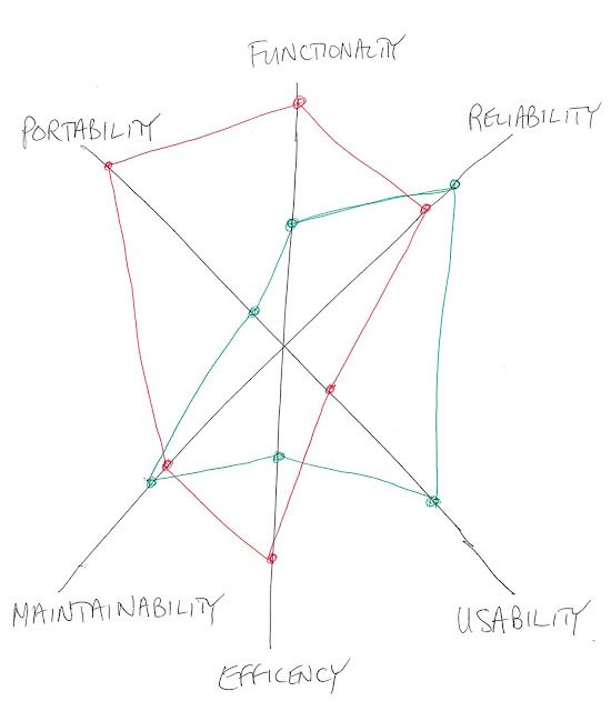 In this radar chart I have drawn a line from a central point for each of the six software quality characteristics described in the ISO 9126 standard. Although the lines are not labelled with a scale of values it is easy to imagine that the scale represents the importance of the characteristic. As a value moves further out from the centre, the quality characteristic becomes more important.
Two sets of values have been plotted on the chart - red and green. For the red values, functionality and portability are rated as the most important characteristics; reliability, efficiency and maintainability are average; while usability is relatively uni-important.
One of the strengths of a radar chart is that it can be used to compare two or more sets of values - in this case the red and green values. Compared to the red values, the green values show that most of the characteristics have pretty average importance; while portability is relatively uni-important.
The red and green values might be a comparison of two different software packages, an existing application and its potential replacement or maybe two different development platforms. The values might come from a formal evaluation of the current situation or they might describe the subjective needs of a group of stakeholders.
When a radar chart is used to represent subjective data, a dot voting system can be quite useful (see Gamestorming for a good explanation of dot voting). Dot voting can be especially useful when the radar chart is intended to capture the outcomes of a workshop.
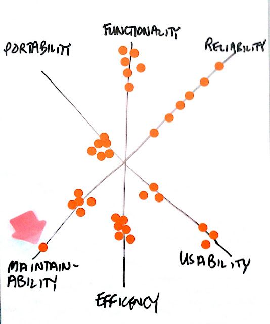 In this radar chart six people have been give six orange sticky dots and told to “vote” on the importance of each of the ISO characteristics. Placing a dot further from the centre indicates that the characteristic is important, closer to the centre that the characteristic is less important.
The chart also illustrates a number of patterns that frequently occur in dot voting. We can see that there is pretty good consensus on the fact that functionality is important and portability relatively un-important. Contrast this with reliability, where we can see an obvious lack of consensus and usability where we appear to have to opposing schools of thought - maybe even politics at work?
Maintainability is interesting because we have pretty good consensus except for one vote which is different to the rest. It is tempting to label this an “outlier” and ignore it but be careful! We are not dealing with pure statistical data here. Possibly the person who voted differently has some important knowledge that the others don’t. You should carefully investigate all outlier votes to discover why the vote is different to the rest.
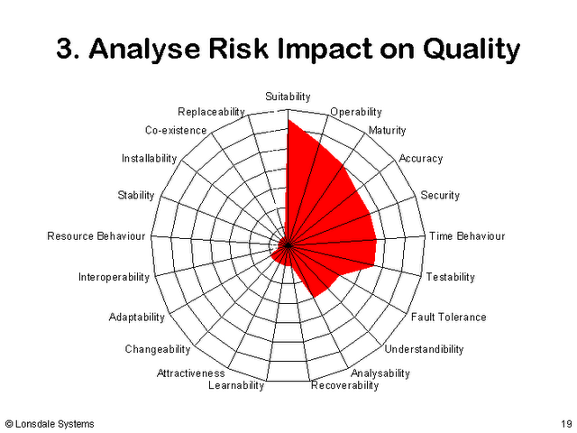
Radar charts feature in our Software Testing Course as part of our approach to risk based testing. We use them to summarise the high-risk areas of a software product that should attract the most interest from software testers. An example (not a big visible chart unfortunately) is shown in this slide.
 Radar Charts